website refresh
Beachside
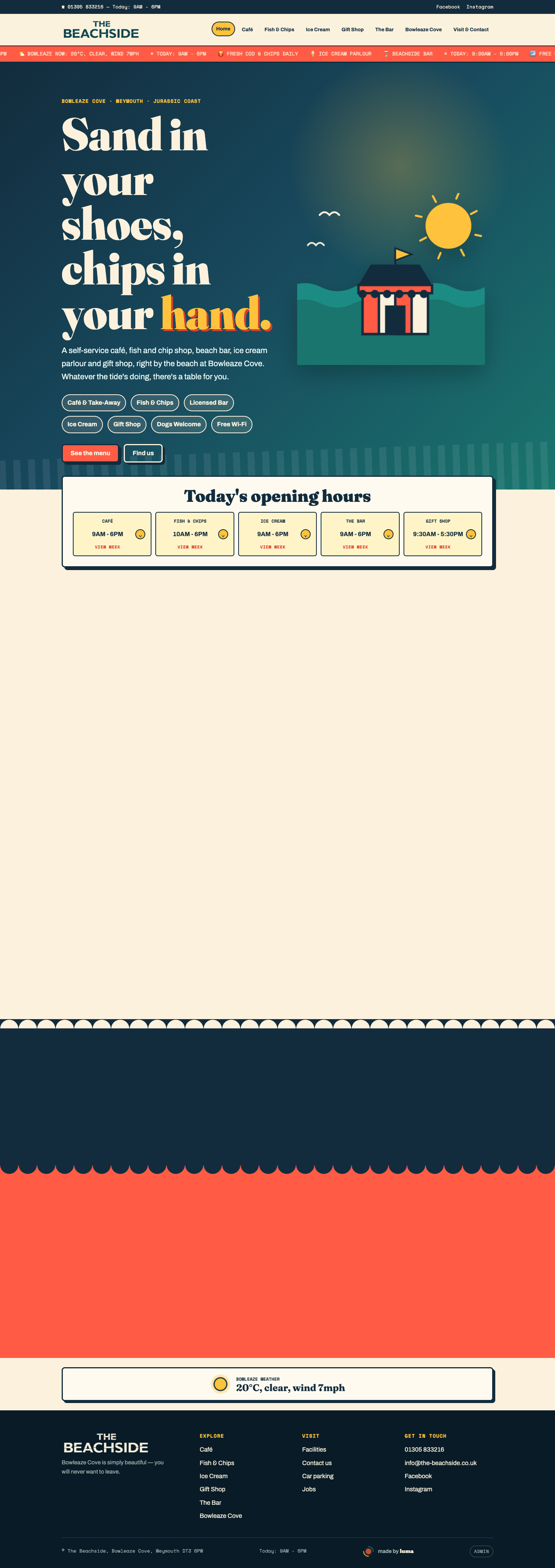
Beachside is a café, gift shop, bar, and takeaway by the coast. Their old WordPress site was no longer doing the job, so we refreshed the page with a brighter feel, clearer sections, and an easier way for visitors to browse what is on offer.
scope
from tired WordPress page to fresh coastal website
The goal was to make Beachside feel as welcoming online as it does in person: clear opening info, simple navigation, a strong first impression, and dedicated space for the café, takeaway, gift shop, bar, and ice cream offer.
main changes
what we did for Beachside
clearer homepage
Reworked the page around the main visitor question: what can I get here, when is it open, and how do I visit?
easy menu experience
Added a simpler menu structure so people can quickly browse café food, fish and chips, ice cream, drinks, and takeaway options.
stronger coastal feel
Gave the site a more distinctive seaside style with bolder typography, warmer colour, and playful visual details.
before and after
the refresh in plain terms
old WordPress site
The previous site was not showing the full Beachside offer clearly enough. Visitors needed a quicker way to understand the café, takeaway, bar, gift shop, opening info, and menu options.
clearer coastal page
The refreshed page gives Beachside a stronger first impression, simpler navigation, easier menu browsing, and a more memorable seaside feel across desktop and mobile.
site structure
what the new page includes
offer sections
Split the site into clearer areas for café, fish and chips, ice cream, gift shop, and bar.
visit info
Made opening times, location cues, and contact routes easier to spot.
mobile layout
Built the page to feel usable on phones, where most visitors are likely checking before heading over.
live deployment
Moved the refreshed site onto a fast modern deployment so it is easier to share and maintain.
screens
desktop and mobile preview
